Case study

At Home - Visual Identity

← Back to project list Design Social Network
At Home - Visual Identity

About.

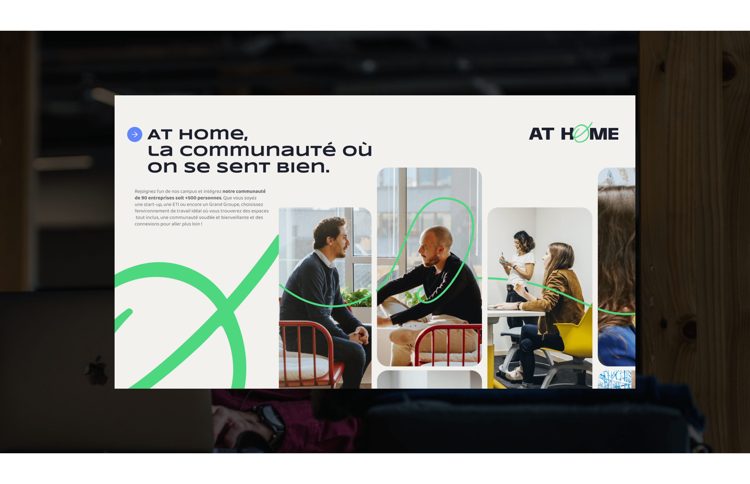
At Home, a community-focused coworking space in Toulouse, has evolved from a startup co-location into a thriving entrepreneurial ecosystem. It provides a supportive ecosystem that helps over 90 companies and 500 professionals.


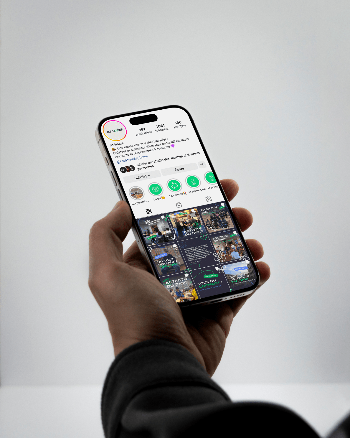
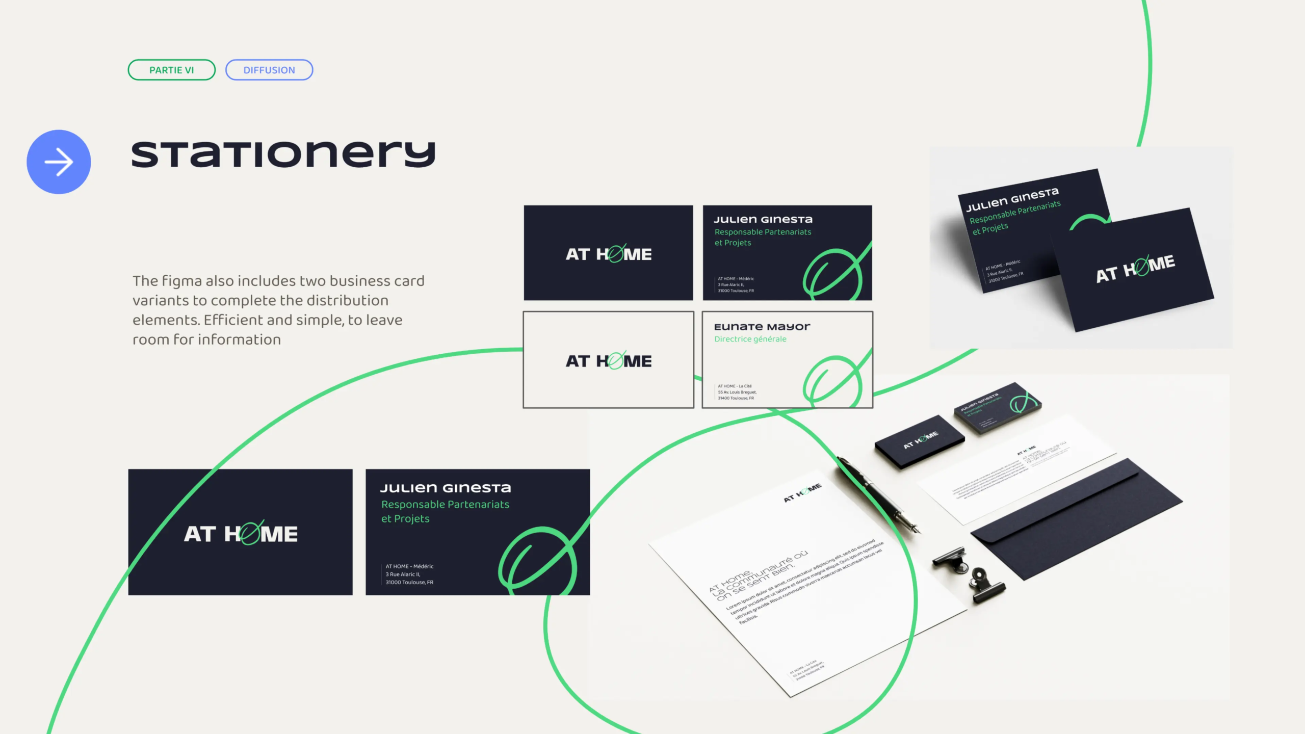
We revamp their entire visual identity, starting with a refreshed logo design that blends the brand's established elements with new, dynamic features that represent their current values and mission. We developed a cohesive brand book, created visual assets for consistent communication across all platforms, and implemented UI/UX design improvements to their digital presence.


This project aimed to showcase At Home's transformation and solidify their position as a leading, innovative, and responsible coworking space.
Crafting a fresh Identity reflecting AT HOME's growth as a Community-Focused Coworking Space.

Illustration 2062
Illustration 258
Illustration 9449
Illustration 813

Result.

We delivered a comprehensive brand identity refresh for At Home, including a new visual guideline, logo design, and visual assets for consistent brand communication.


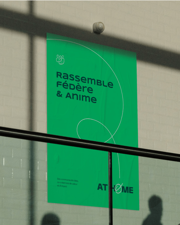
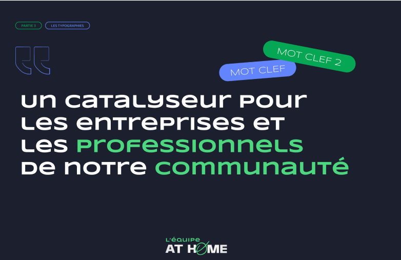
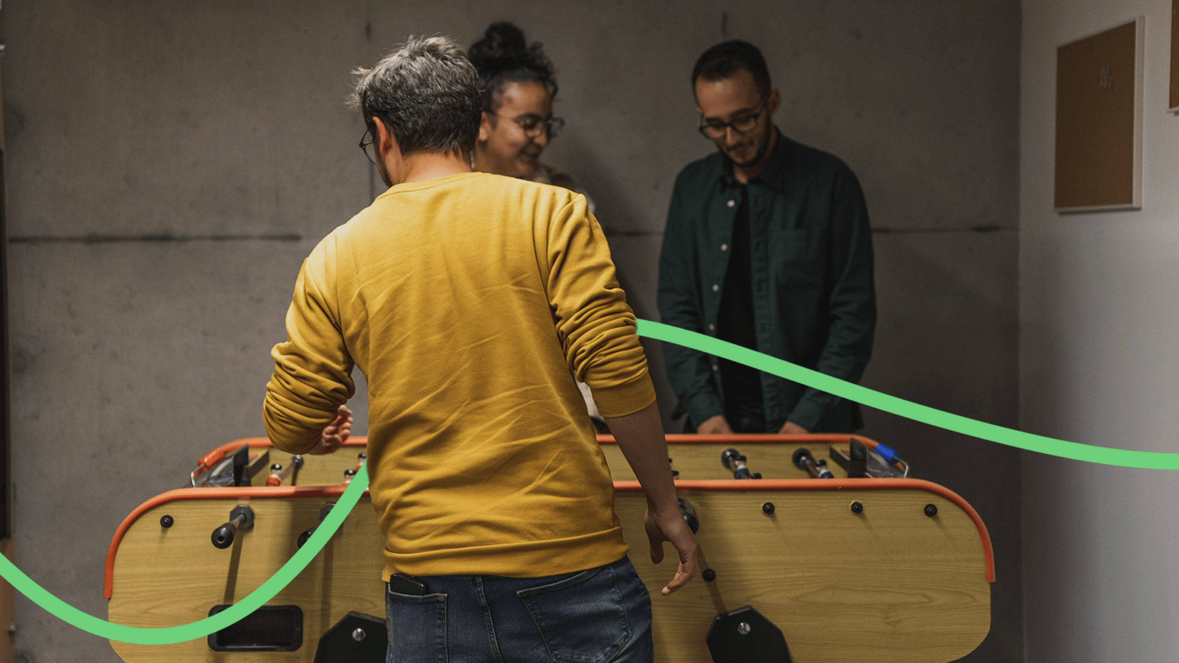
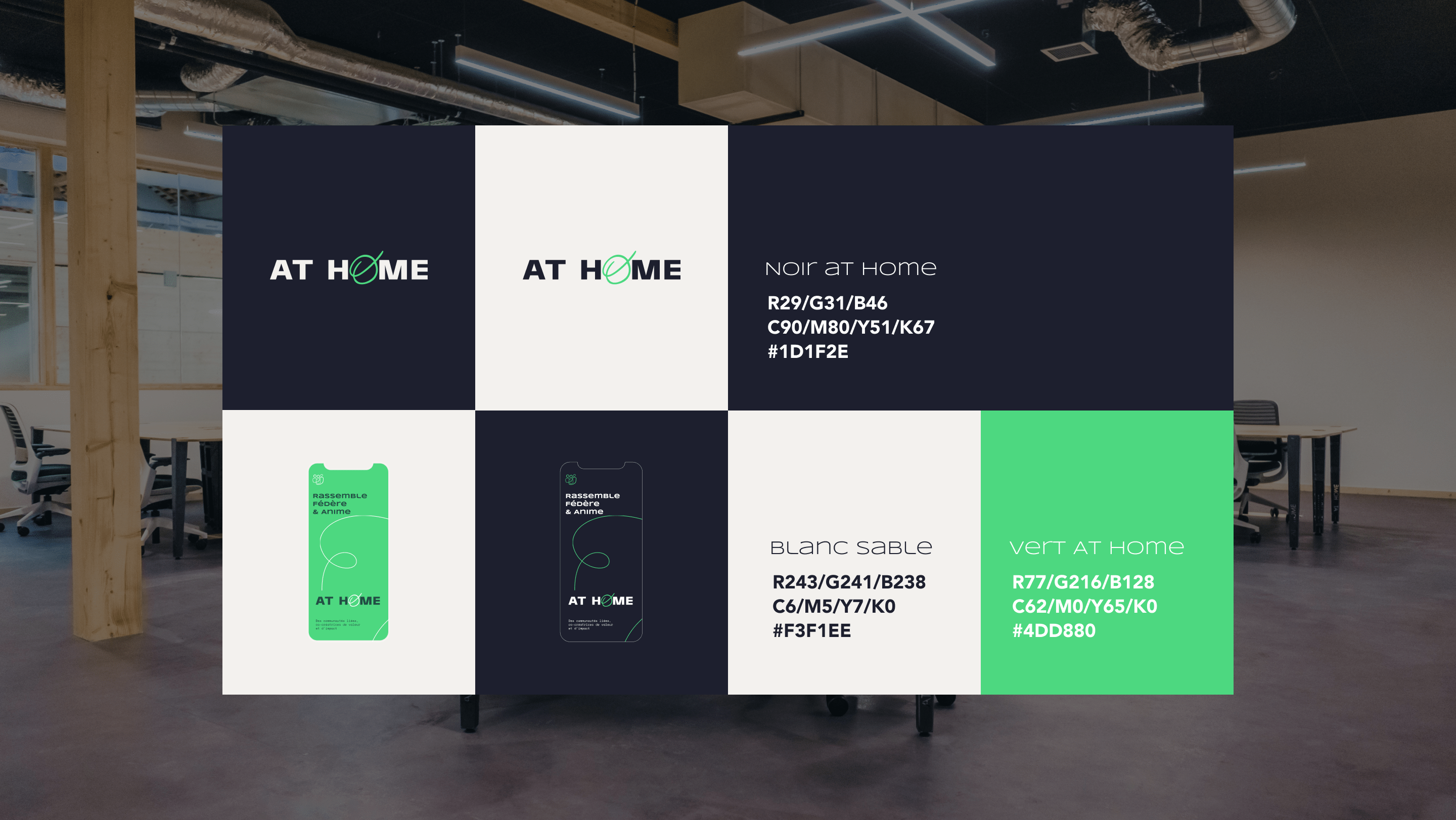
The updated visual identity echoes the brand's established image while highlighting its new commitments and evolution. The emblematic green color was retained and enhanced with visual gimmicks that represent the entrepreneurial journey and energize communication materials.


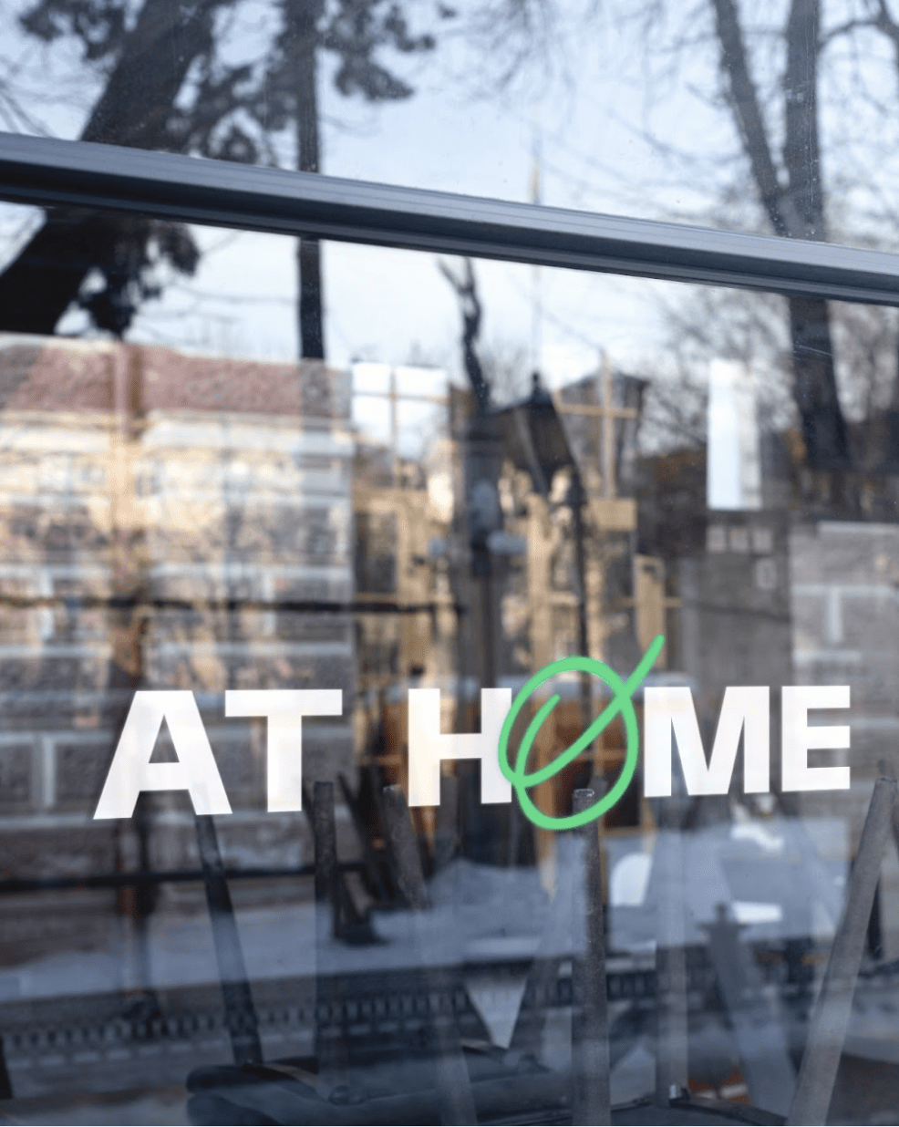
The redesigned logo, balancing formality with subtle handwriting, serves as the foundation for various icons that symbolize life within the At Home community.

Illustration 6301
Illustration 1845
Illustration 3257
Illustration 3560

Credit.

Special thanks to At Home for their trust and collaboration.


Client: At Home Collaborative effort by the entire team at Studio DOT:

  • Logo
  • Brand Identity & Brand guidelines
  • Design (stationery, sticker, merch).
Tools & technologies: Adobe Suite, Figma, After Effects
Contact us

Start a conversation.